SAFRA - Revamp Website 2012
When I joined the A8 design agency, I was responsible for the UX and UI design of SAFRA's website. I worked closely with a senior UX designer.
My Role
I was responsible for UX and UI work.
Target Audiences
Singapore military servicemen
Age:Above 16 years old
Goals:Enable visitors to understand SAFRA’s services, facilities, and benefits quickly and become involved in it.
Persona

NS Men Male 20-29 years old
Profile Description
Profile Description
- More tech-savvy and tolerant
- More exploratory in their browsing habits
- Easily navigate the website by associating the content with the imagery around it.
- Most of them prefer to look at activities on the website

NS Men Male - 30 > years old
Profile Description
Profile Description
- Tech Savvy
- A bit less tolerant (If they don’t find the content they are looking for, they will call instead)
- Prefer quick and direct access to content
- Most interested in promotions
- Half spent more time navigating as they needed to use the supporting text below. However, half were savvy enough to navigate with ease.
NS Men Married (with Children) – 40 > years old
Profile Description
Profile Description
- Less Savvy
- Looks for more activities that involve family
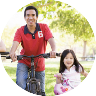
- Primarily interested in promotions and browsing around for exciting activities/events
- They spent more time navigating as they needed to use the supporting text below
Testing
After we finished the design, we made the key pages that needed to be tested into an interactive prototype. Then, a one-to-one test was performed on 30 people among 3 different kinds of users. After the test, we got a lot of feedback and made changes. The following are the main findings:
- SAFRA's users mainly visit the website to look for information regarding facilities' operating hours, booking information/contact, or any announcement regarding facilities
- Activities/Courses are next the main reason SAFRA’s members visit the website.
- Quite many users browse for promotions (hottest: GV Movie Tickets)
- Some find the current website very informative but a bit too much. Searching for some event details would be better than using the navigation.
First Impression on the Website
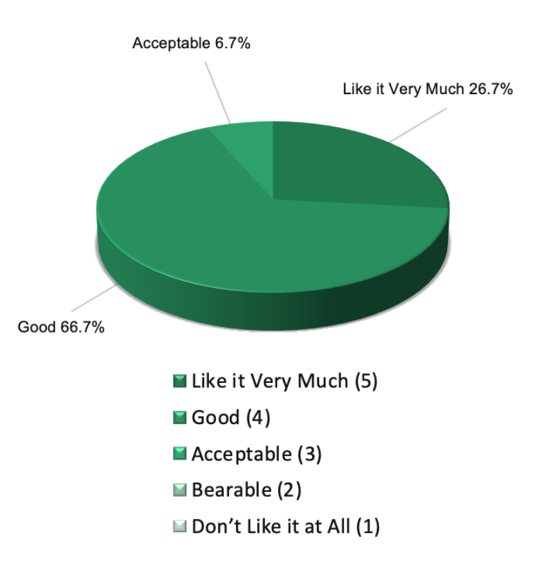
- Everyone had a positive first impression of the new website.
- 66.7% replied that they found the new website looked and felt good, 26.7% liked it very much, and the rest found it acceptable
- All users found the website more vibrant, attractive, eye-catching, and engaging.
- Most users found the items on the home page interesting, enticing them to read more.
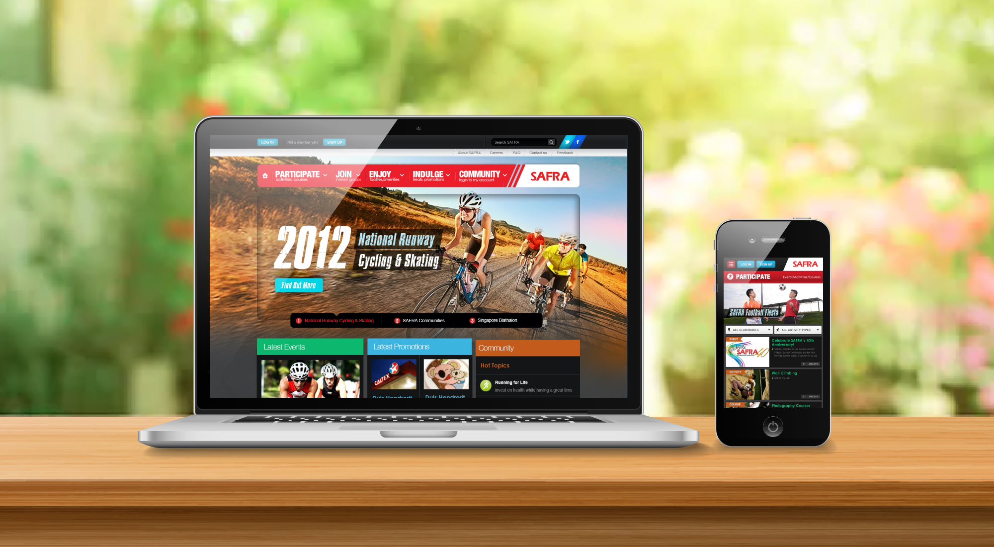
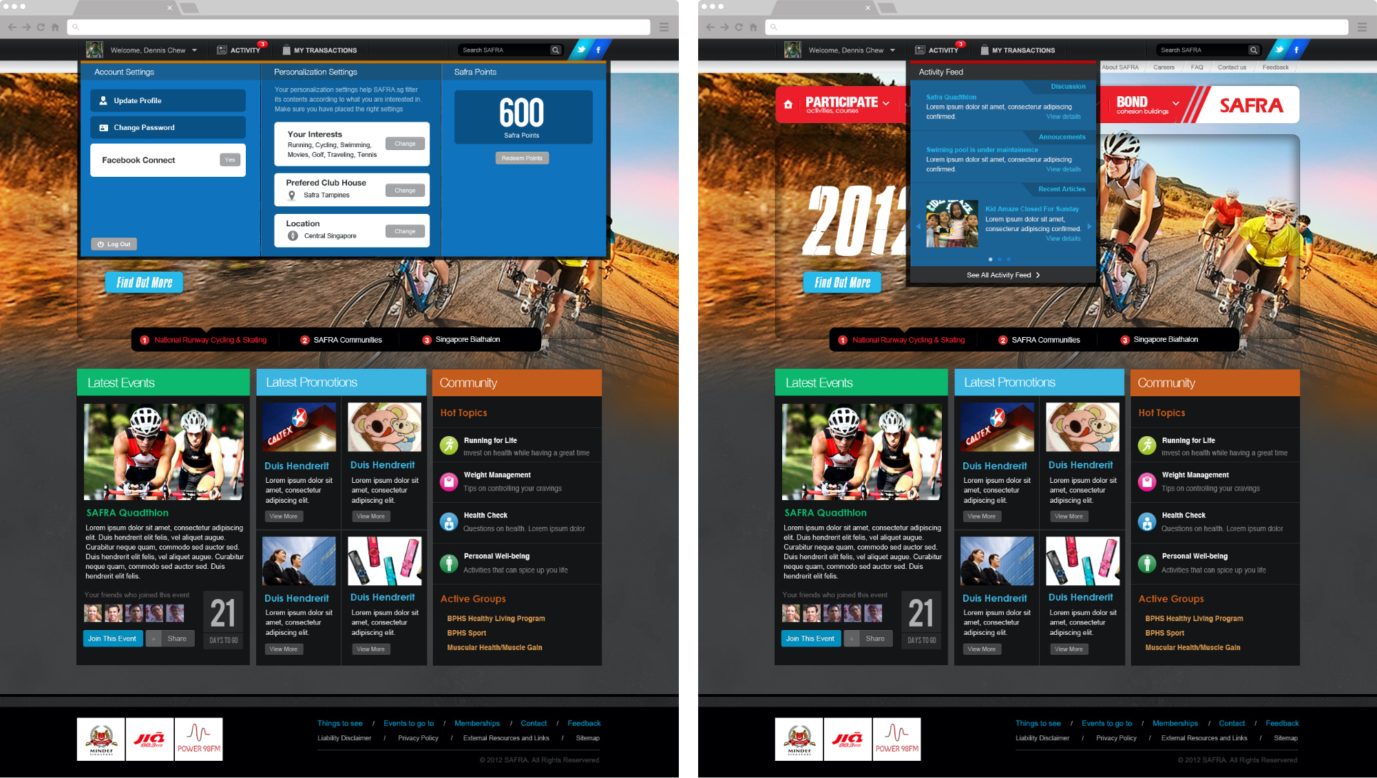
Home Page
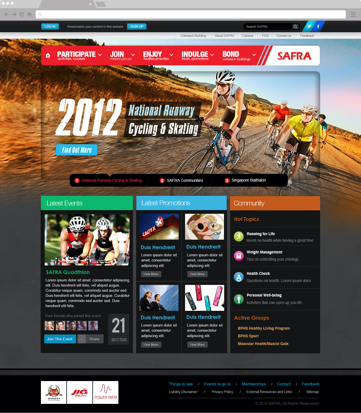
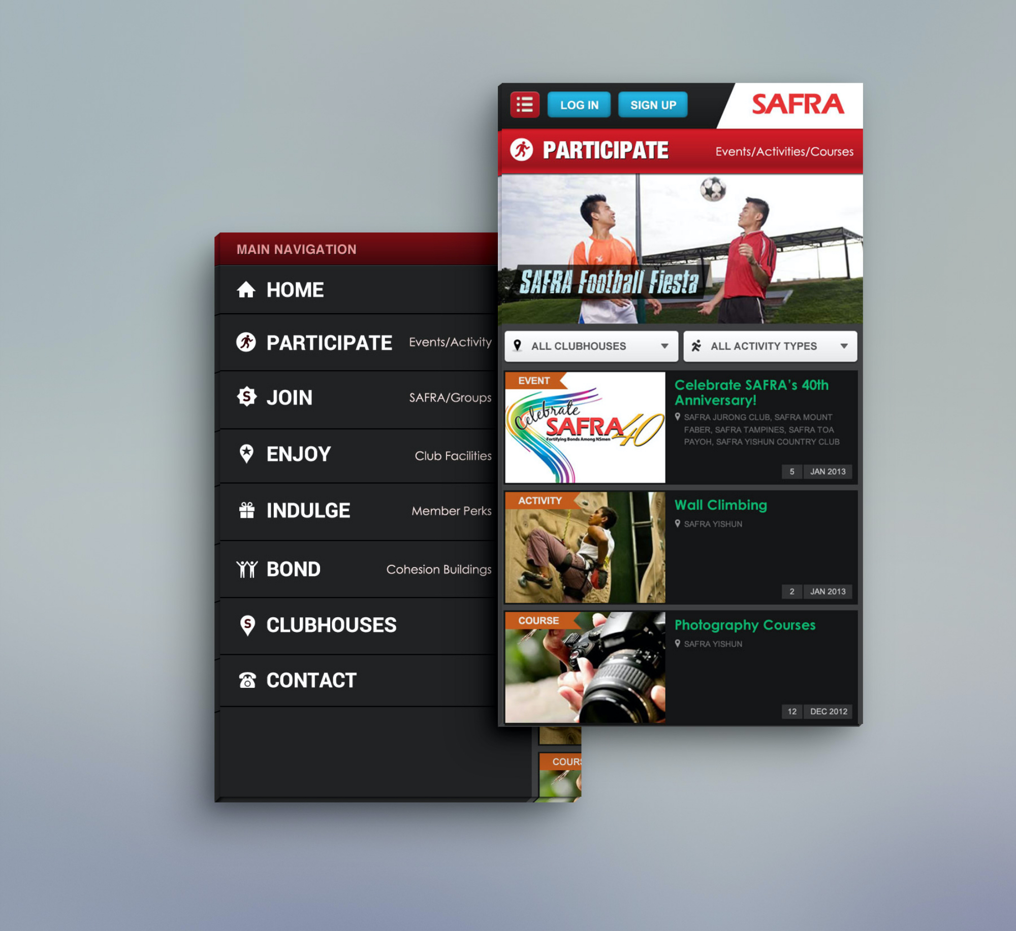
Mega Menu
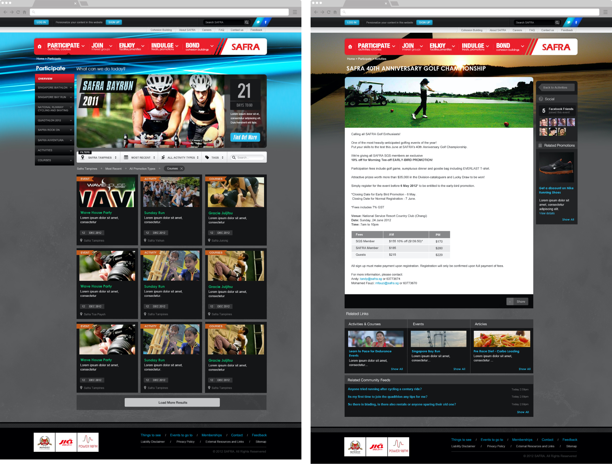
Participate Activities
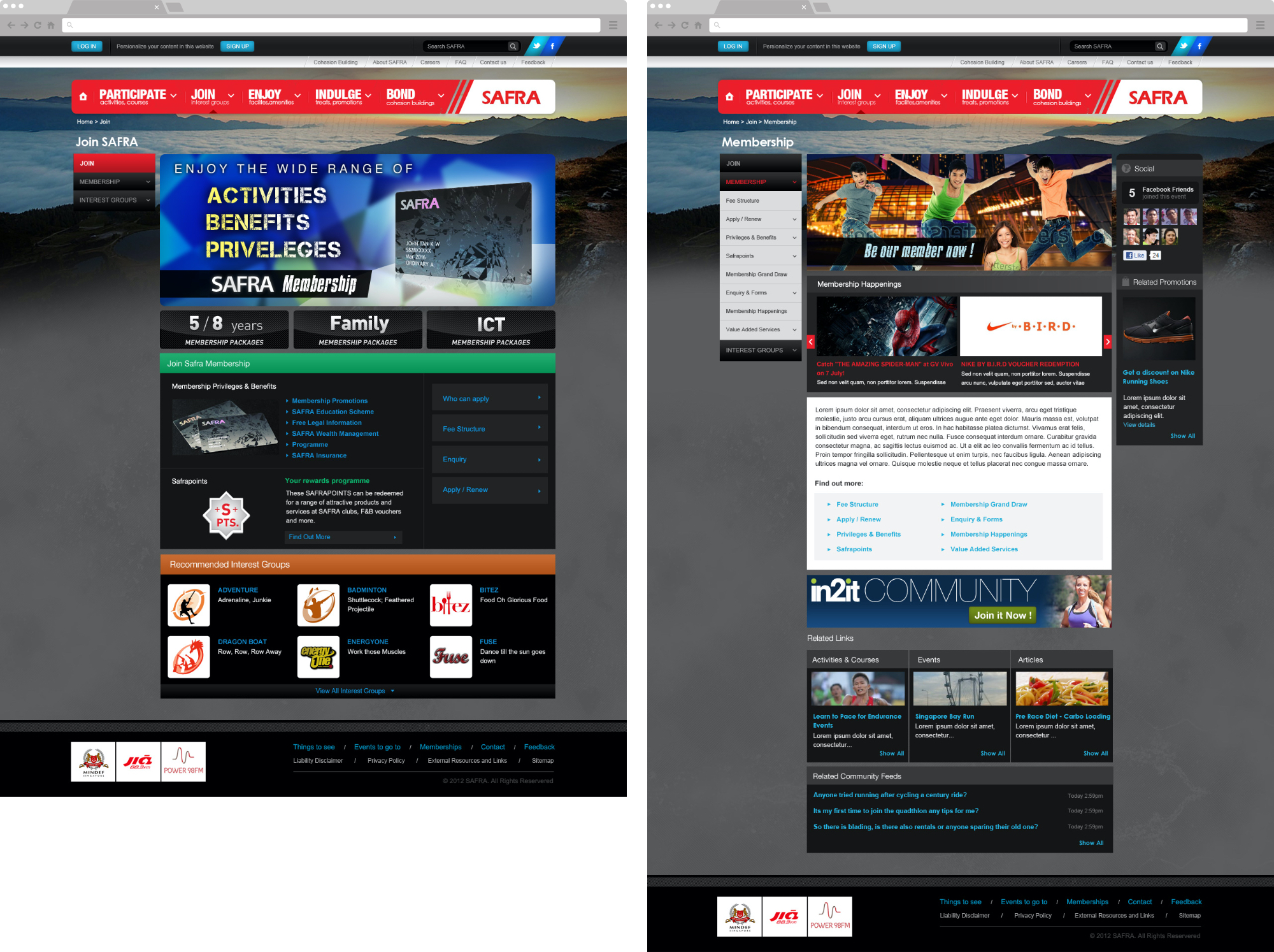
Join SAFRA
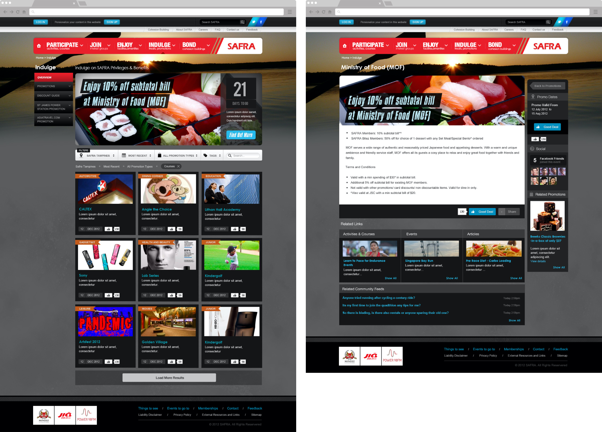
Indulge Promotions
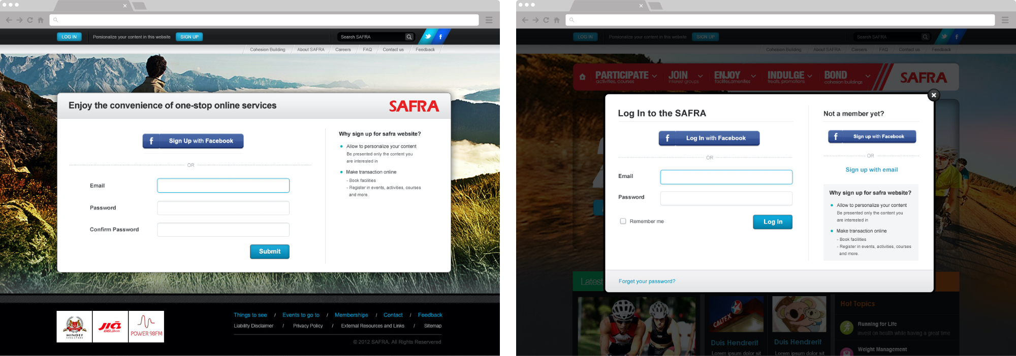
Log In, Sign Up
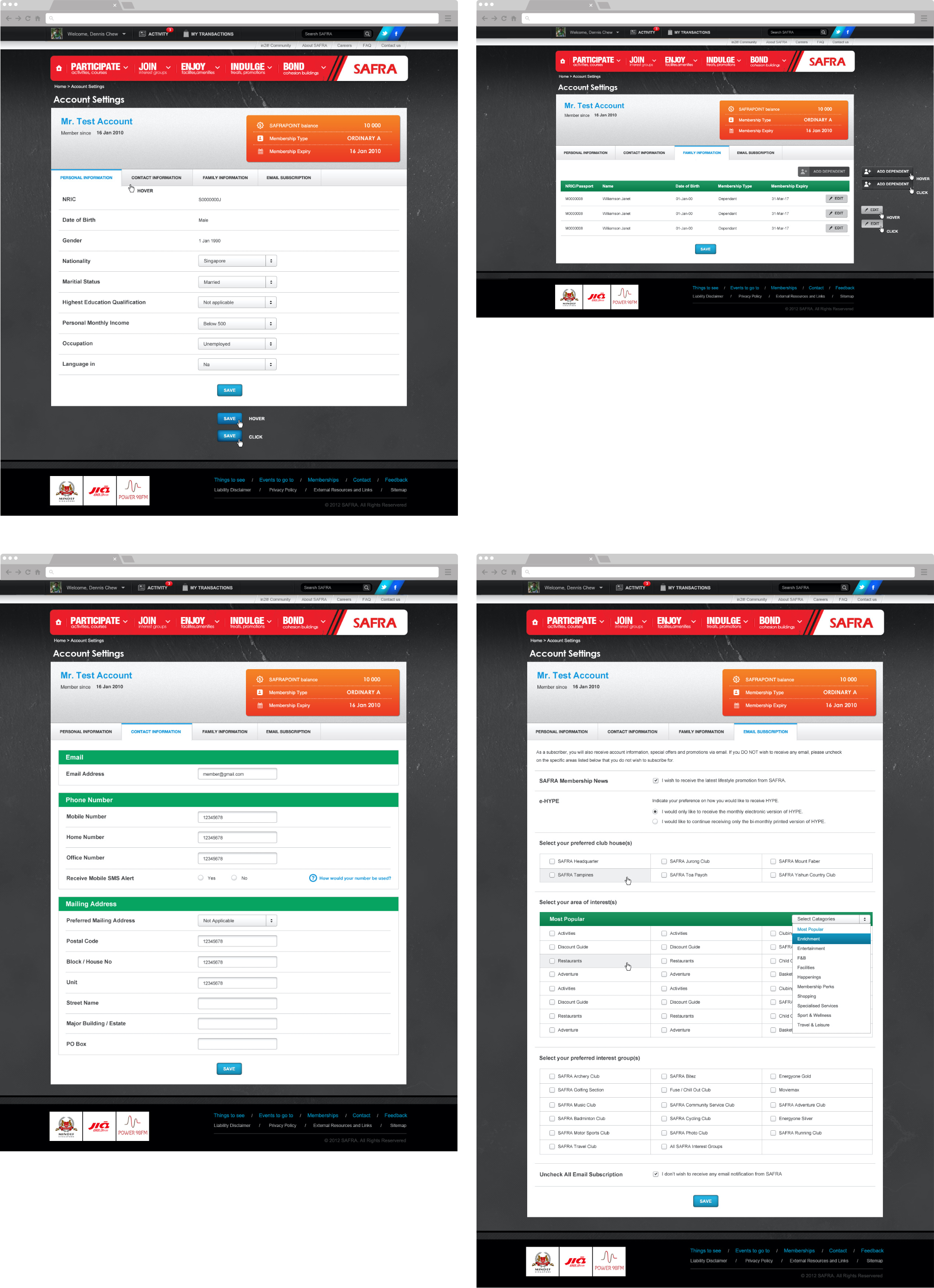
Account Settings
Mobile Version
What I Learned
- Regarding a tremendous amount of content, user testing helps prioritize the content.
- When conducting user testing, it is vital to observe user interactions patiently to find their main points to optimize content and design.
- We can’t rely too much on user testing to create new functions because sometimes users don’t know what they want. They could just want a faster horse. So we have to be creative.
- Some users’ feedback is subjective, so we must evaluate it before adapting it.
- Working on a massive UI design of the entire website can improve design skills.