Singapore Tourism Board - Website Bid Project 2013
In 2013, Singapore Tourism Board (STB) opened a tender, and they wanted to redesign their website. I was assigned to work on this bid with 1 senior UX & UI designer and 1 junior UI designer. I worked closely with the team on design proposals. In the end, we won the bid.
My Role
I worked closely with the team to brainstorm and have discussions. I also designed the content architecture, user experience, and user interfaces.
Timeline
1 week
Understanding the Requirement
The main task of the Singapore Tourism Board is to help small and medium-sized enterprises take advantage of the tourism industry. They also provide high-quality information to their target audiences. Besides, it promotes Singapore's tourism to other countries. Hence, the critical point of the entire website is to help users quickly understand the commercial assistance of the Singapore Tourism Board.
Target Audiences
- Singapore SMEs
- Foreign countries
Persona
Name:Rebecca Lim
Occupation:Marketing Director
Relationship:Industry Partner of Singapore Tourism Board
Scenario: She would like to find more insightful information from the Singapore Tourism Board website to help her business.
Brainstorming
We conducted a series of UX evaluations on the existing website, company evaluations, and character research. We had some in-depth discussions and decided to optimize the entire website from the content structure so that users can quickly get help from STB.
UI Design Research
I took a reference on some international websites and Behance to figure out how to make an attractive design and decide on the art direction. After discussing with the teams, we confirmed the design direction, and I proceeded to UI design. After I completed it, I shared it with the team, collected insight, and made the changes.
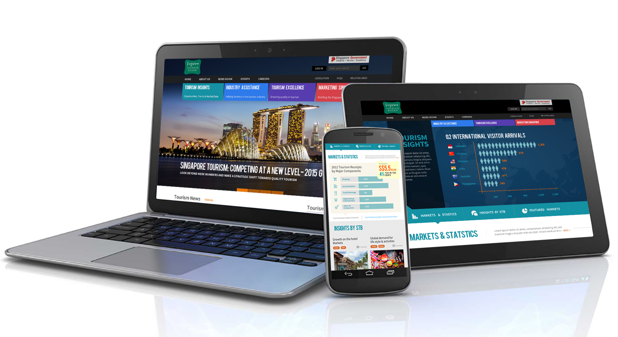
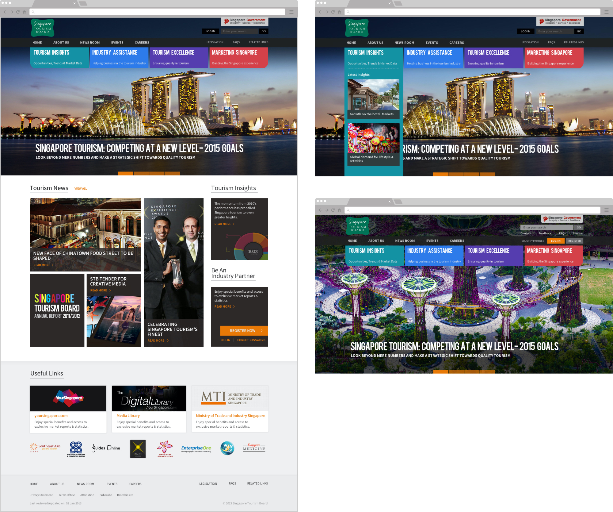
Home Page
We put the four essential abilities of STB on the homepage with different colors to highlight its capabilities to the target audiences. In addition, we designed the entire page with attractive images and layouts instead of cumbersome text.
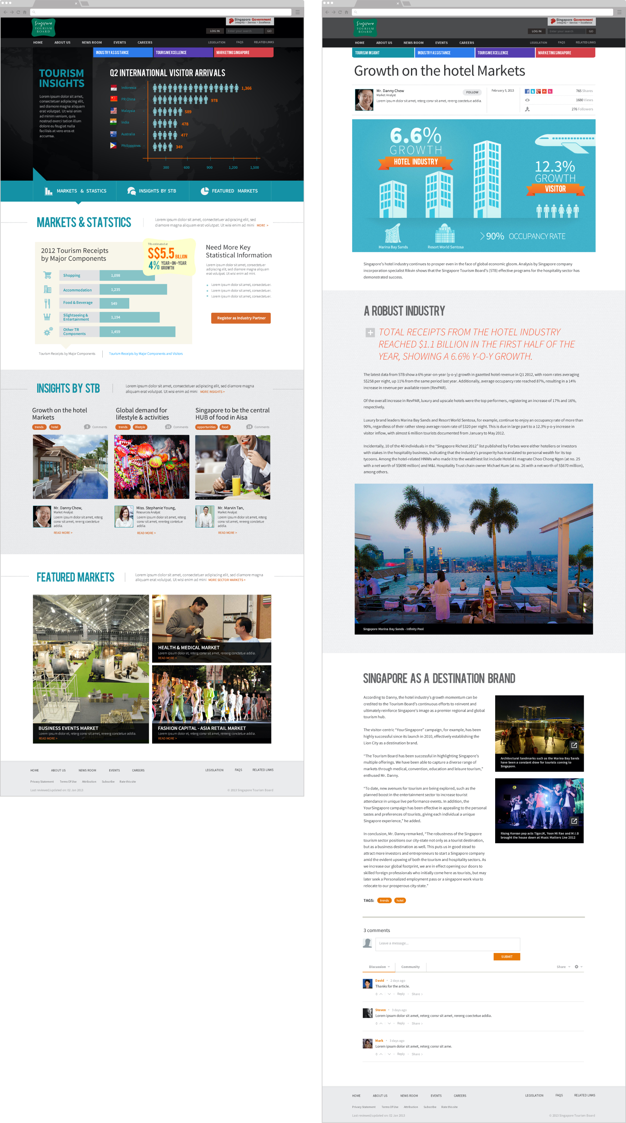
Inside Page
We used infographics instead of text to display reports & research to make it easy for users to understand.
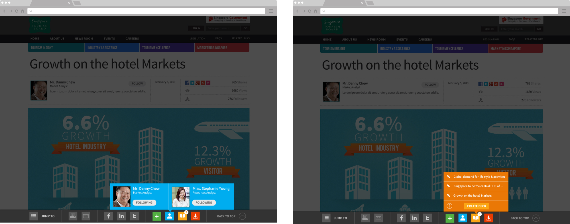
Personalized Content
After the user login, they will see personalized content based on their attributes.
More Ideas
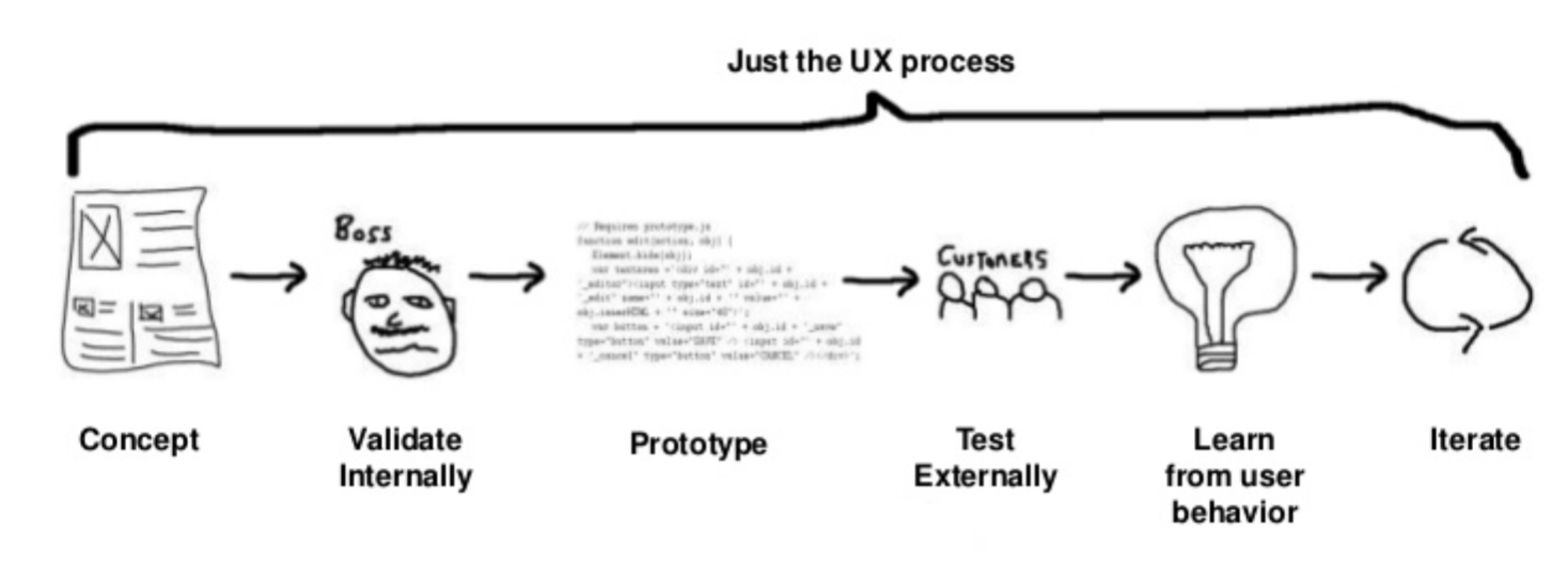
In the proposal, we also propose using the Lean UX method, which includes qualitative research, quantitative research, user research, heat map analysis, web heuristic evaluation, etc.
Impact
We won the bid. However, I left the company and did not participate in the web development process.
What I Learned
- By understanding the needs of clients and users, we can effectively design the right products suitable for customers’ and users’ needs with creative solutions.
- Based on the 20/80 principle, the critical 20% factor affects the 80% results, so we need to find out the 20% and work smart and effectively.
- We have to propose something new and effective in the market to win the deal. To achieve that, we must keep up with trends and do more in-depth research.
- It is good to leverage the past insights and experiences from the previous website projects on the new website to get better results.